Header - Shop and Learn
Global Header
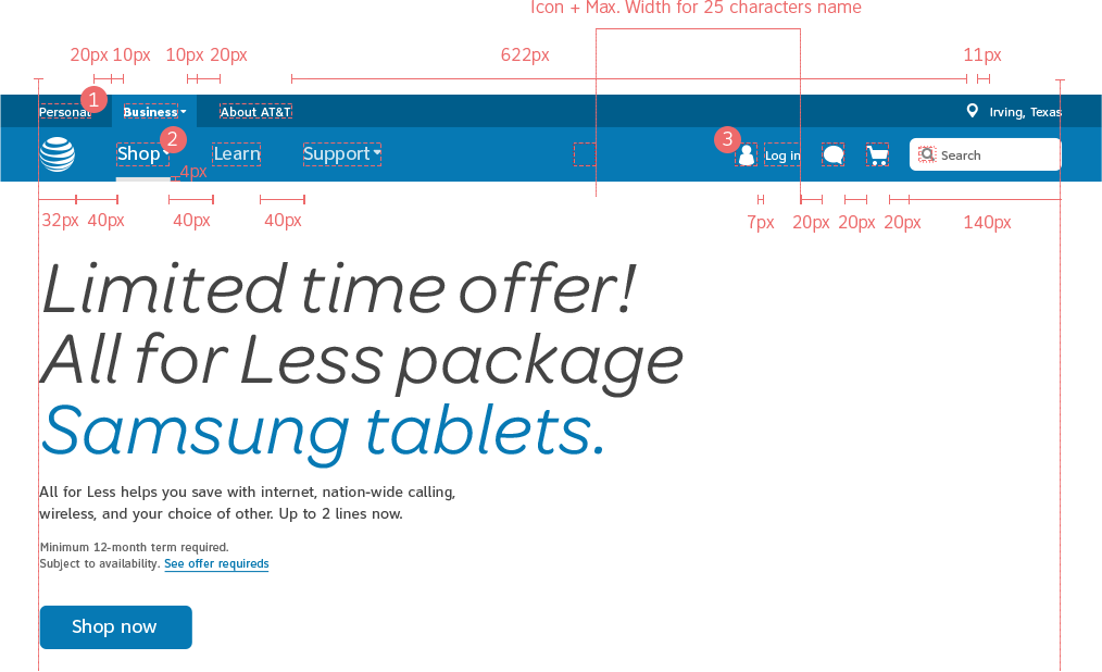
GUIDELINES
- Global Header always occupies full width of any screen.
- Shop landing page is the home page by default. Menu show with “Shop” selected.
- On hover over “Shop”, the “Wireless” menu flies out automatically.
- “Learn” menu doesn’t have a menu and therefore opens on click.
- Body Copy
Default state: Clearview Book 12px
Active state: Clearview Bold 12px - H4 - Clearview Book 18px
Default: #FFF 80% opacity
Active and Hover: #FFF 100% opacity
- Text: Clearview Book 12px.
Icon: 20px total size.
Default state: #FFF 100% opacity
Hover state: #FFF 80% opacity
SUPPORT MENU
Contextual Navigation
WIRELESS MENU
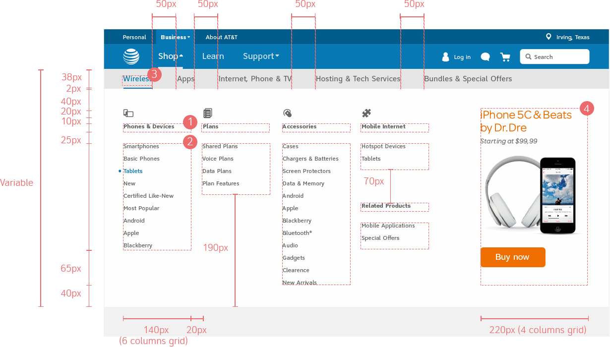
GUIDELINES
Promotional Banner
Fixed size of 220 x 360px
Always place CTA
Title
Omnes Regular 24px
Max. of 36 characters
(2 lines of text)
Promo Tagline
Omnes Regular Italic 16px
Max. of 52 characters
(2 line of text)
Thumbnail container
220 x 170 px
Image with transparent background
Visual composition with a maximum of 3 elements
Call-to-action
Always use large CTA buttons (40px)
It can either be a primary action button or a buy action button.
- To avoid a rough transition between menus, there’s an ease and fade in animation between menu heights.
- Body Copy
Clearview Bold 12px
Maximum of 65 characters, 3 lines of text, in a 140px width text box.
Defaut state: #666
Hover state: #0091D9
Active state: #0574ac - Body Copy
Clearview Book 12px, 35px line-height.
Maximum of 12 items per column, 140px width text box.
Defaut state: #666
Hover state: #0091D9
Active state: #0574ac - Clearview Book 16px. Text is centered to bar. Variable number os items in menu.
Padding adjust up until a minimum of 20px.
Defaut state: #666
Hover state: #0091D9
Active state: #0574ac + underline of same color (fixed height of 2px and variable width according to word)
APPS MENU
APPS MENU - TOOLTIPS
INTERNET, PHONE & TV MENU
HOSTING AND TECH MENU
BUNDLES & OFFERS MENU
BREADCRUMBS
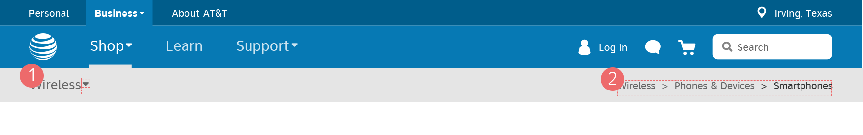
GUIDELINES
- Clearview Book 16px. Text is centered to bar.
Default: #666
Active: #0574ac
Always provide level 2 section of the contextual nav.
On hover over Wireless, the menu flies out automatically.
(View Breadcrumbs SPEC TEC for details on charaters.)
- Body Copy Clearview Book 12px
Last item (not clickable): #444
Defaut: #666
Hover: #444 + borderline 1px stroke and 3px padding
Breadcrumbs should only show items after the second hierarchy level (Global nav. and SBO header items not included).
(View Breadcrumbs SPEC TEC for details on charaters.)
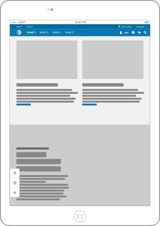
SCROLL
Breadcrumbs
REGULAR DISPLAY

GUIDELINES
- Breadcrumbs should only show items after the second hierarchy level (Global Nav and SBO Header items not included.)
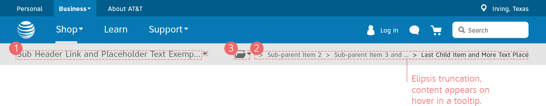
- Text truncates with ellipsis if bigger than 100 characters. Currently AT&T has producst with 125 characters but due to adaptive, they’ll have to be truncated.
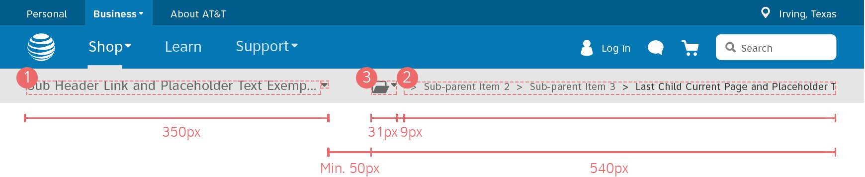
- Last child in breadcrumb dictactes when others collapse to “folder icon”. The maximum width for the last item is 480px and 100 characters, before truncating.
- Breadcrumbs should include items after the Contextual Navigation items. So first item on breadcrumb should be the sections of the contextual nav., like “wireless”, “internet, phone & tv”, bundles, etc.
Truncation
- Truncate at end: When the first characters impart the info to the user and the last are least important.
- Truncate up front: When the last characters impart the info to the user and the first are least important.
- Truncate in the middle: When the first and last characters impart the info to the user and the middle are least important.
- Clearview Book 16pt
Maximum of 45 characters, 1 line of text, before truncating with ellipsis. - Clearview Book 12pt.
Maximum of 100 characters, 1 line of text, before truncation.
Last child is always displayed.
Sub-parent items can grow up to a maximum of 123px width.
Maximum of 17 characters before truncation with ellipsis.
Breadcrumbs are divided with a “>” (less than) character.
If last item grows than remaining sub-parents hide and a folder icon appears as a drop-down.
- Folder icon with 20px size+dropdown icon with 10px size.
WHEN LAST ITEM GROWS
WHEN SUB-PARENT GROWS
LAST ITEM MAXIMUM + TRUNCATION

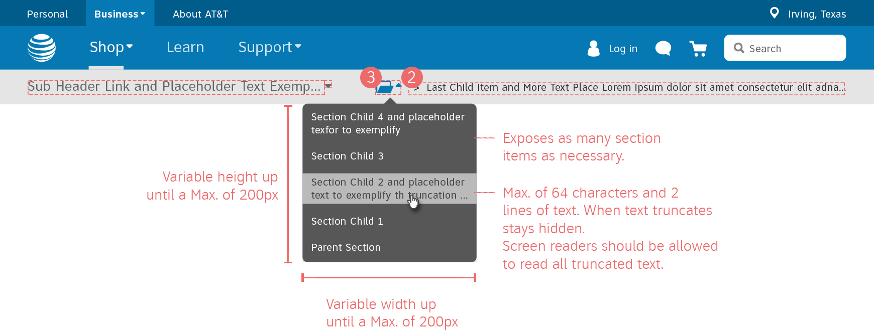
TABLE PORTRAIT

Sticky Bars
Mini Configurator

GUIDELINES
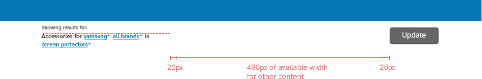
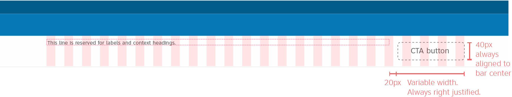
- Sticky Bar is white #FFF with 95% opacity.
- Button has center alignment relatively to the Bar.
- Variable text style depending on number of characters.
30 CHARACTERS
GUIDELINES
- Option 1: from 1 to 30 characters
Omnes Regular 24pt
Maximum of 30 characters, 2 lines of text, in a 170px width text box. Break line when appropriate.
40 CHARACTERS
GUIDELINES
- Option 2: more than 30 characters
Down-scale to Clearview Book 18pt.
Maximum of 40 characters, 2 lines of text, in a 170px width text box. Break line when appropriate
70 CHARACTERS
GUIDELINES
- Option 3: more than 40 characters
Down-scale to Clearview Book 14pt.
Maximum of 70 characters, 3 lines of text, in a 170px width text box. Break line when appropriate
85 CHARACTERS
GUIDELINES
- Option 4: more than 85 characters
Down-scale to Clearview Book 12pt.
Maximum of 85 characters, 3 lines of text, in a 170px width text box. Break line when appropriate
Natural Language Form
1.
GUIDELINES
- Natural Language Form only:
Omnes Regular 24pt.
Up to a maximum of 3 input fields.
Maximum of 80 characters, 1 line of text, in a 800px width text box.
2.
GUIDELINES
- Natural Language Form + other content:
Down-scale o Clearview Book 14pt.
Up to maximum of 3 input fields.
Maximum of 85 characters, 2 lines of text, in a 300’x width text box.
GUIDELINES
- Content alignment should always consider 20px grid. Content is always left justified. Between stacks of content always consider 20px padding.
- First stack of information should always be related to the current page - product or service title.
- Variable width up until a maximum of 300px. Consider downscaling modules for the text styles.
- According to the widest CTA button (Add to Cart) content has a maximum width of 770px
- Apply any type CTA button according to context and content.
MODULE 1
MODULE 2
From 1 to 54 characters
Omnes Regular 24pt
Maximum of 54 characters, 2 lines of text, in a 300px width text box. Break line when appropriate.
More than 54 characters
Clearview Book 18pt.
Maximum of 68 characters, 2 lines of text, in a 300px width text box. Break line when appropriate.
MODULE 3
MODULE 4
More than 68 characters
Clearview Book 14pt.
Maximum of 132 characters, 3 lines of text, in a 300px width text box.
Break line when appropriate.
Up to 157 characters max.
Clearview Book 12pt.
Maximum of 157 characters, 3 lines of text, in a 300px width text box.
Break line when appropriate.
TRUNCATION
More than 157 characters
Clearview Book 12pt.
Truncate text with shade and beware that this text is always hidden. Not problematic if current page displays full title.
Skin 2
Links Text Styling
Texts that accompany blocks of copy should take on the size and text-styling of the copy block it is attached to. For example:
has finally arrived. See it now. The All-new Apple iPhone 5S
has finally arrived. See it now. The All-new Apple iPhone 5S
has finally arrived. See it now. The All-new Apple iPhone 5S
has finally arrived. See it now. The All-new Apple iPhone 5S
has finally arrived. See it now.
GUIDELINES
- Appears at first glance centerer with first page banner (aprox. 700px).
- 40px distance between itself and site’s content area.
- Placed on the left side of the screen.
- Box width grows according to content up until max. width of 188px.
SCREEN SMALLER THAN 980PX
GUIDELINES
- Use of the simplified vertical navigation.
- 40px distance between itself and site’s content area.
- Placed on the left side of the screen.
- Menu width grows according to content up until max. width of 188px.
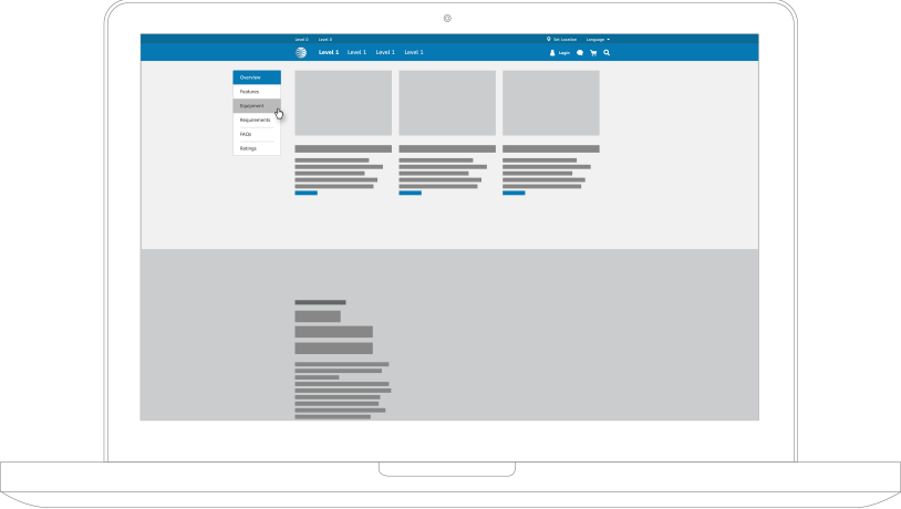
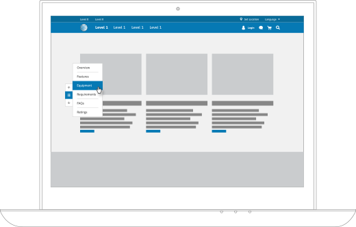
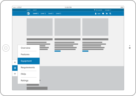
Devices
GUIDELINES
- Vertical nav menu on tablets is the same as in desktop version.
- Simplified version of vertical nav.
- There’s no hover state on tablets and mobile.
- Back to top appears only on the bottom of the page.
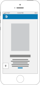
- On mobile devices, vertical navigation does NOT exist.
Tabs
Tabs with illustrations
A - 6 COLUMNS
GUIDELINES
- First tab is always opened by default.
- Tabs don’t have a close option.
- Maximum of 6 columns when, with 140px width each, tabs have icons. Columns can be combined.
- Tabs background should be #FFF.
- Promo header 4, maximum of 22 characters with 2 lines of text. Break line when appropriate.
- 70 px Icon, vertically center aligned to a 140 px colum.
B1 - COMBINATIONS IN 6 COLUMNS
GUIDELINES
- Header should have a maximum of 52 characters, 2 line of text in a 300px width text box. Break line when appropriate.
B2 - COMBINATIONS IN 6 COLUMNS
GUIDELINES
- Header should have a maximum of 84 characters, 2 line of text in a 460px width text box. Break line when appropriate.
C - 4 COLUMNS
GUIDELINES
- Header should have a maximum of 38 characters, 2 line of text in a 220px width text box. Break line when appropriate.
D - 2 COLUMNS
GUIDELINES
- Header should have a maximum of 84 characters, 2 line of text in a 460px width text box. Break line when appropriate.
E1 - ALIGNMENT
GUIDELINES
- General alignment should be centered.
- The tab alignment should be centered in the column as well as the text box.
E2 - ALIGNMENT
E3 - ALIGNMENT
GUIDELINES
- Column width is mantained and centered to the screen. Padding between columns is fixed - 20px.
F1 - HOVER
GUIDELINES
- Text and icon in hover blue (#0091DA).
F2 - ACTIVE
GUIDELINES
- Background of active tabs must have #F2F2F2 color.
- Any link regarding the tab's subject should be included inside the tab content area.
Simplified Tabs
GUIDELINES
- Keep 40px padding until tabs don’t fit. Then down-scale the padding 10px successively.
Labels
1. Field Set
A. WITH TITLE
EXAMPLES:
B. WITHOUT TITLE
GUIDELINES
- If the element appears along with other elements that either depend on each other or belong to the same group, their labels should be Clearview Book 12pt. These elements should be included on a Field Set. The field Set might or not have a Title associated, which style depends on the hierarchy meant to be established and the aproved text styles.
2. No Field Set
A - ISOLATED ITEM
EXAMPLES:
B - MORE THAN ONE ELEMENT
GUIDELINES
- If the element appears independently or with other elements that are independent from each other, the label should be Clearview Bold 12pt.
Forms
Organization
GUIDELINES
- User activated inline help: This system allows users to access help text only when they want and need it. To reveal the text the user needs to click on a trigger which is represented by an icon.
- Length: Help text should be short and easy to read, so it’s not advisable to exceed 100 words, as it gets to much information for users to handle.
- Tooltips: Should only appear to explain the user why a particular information is needed, when unfamiliar data is asked or to assure that users’ info is secured.
- Iconography: Tooltip icon should be placed next to the field label and not the input field. Upon click, the tooltip should appear above its icon. This will prevent shifting content and leave users disoriented.
- Help text: Avoid the idea of an instruction manual using help text next to fields sparingly. Use help text only when unfamiliar data is asked of users. Make it short and easy to read.
- Accessibility: Tooltips can be activated on click or using the TAB key and closed by clicking outside the box or pressing the down key on the keyboard.
- The forms should be grouped when necessary to organised information from the same “category”.
- Each category should be divided by a line with 50px of padding between the top item and the bottom item. If it’s section title, use 70px from divider to baseline.
- When necessary use information icon which will trigger tooltips.
- When needed, radio buttons and checkboxes can be stacked into columns, as long as they respect the Style Guide for Grid System.
- Call-to-Action button must be left justified with the form, highlighting a clear path to completion.
- Call-to-Action button should be active only when all required fields are filled.
Validation & Feedback
GUIDELINES
- In some cases it’s useful for users to have suggestions of valid information to input on the fields. These suggestions would appear as users are typing the first words.
Valid
- Happens when users insert valid information. This message is momentary and lasts 2 seconds. No copy message required, the positive feedback is implicit.
Warning
- Appears after users pass by an important field without filling it. This box pushes the conten down. This can also happen in cases when users don’t insert the a valid answer - incorrect email structure for example.
Specific error
- “Specific” error messages refer to at least 2 errors that occurs in specific input fields. Appears after users click the primary action button on the form. This is a backend validation message. This box pushes the content down the page. Alignment depends of available screen real-estate.
Generic error
- When filling a form if more than 3 fields have an error than it’s considered generic. Those error messages are displayed in a single column next to the fields in order to avoid obstruct the legibility of the form. This makes the layout less aggressive.
1 Column Format
SINGLE STEP FORM
GUIDELINES
- Has title;
- May or may not have secondary information;
- Does not have a section information;
- Fields are stacked with labels left justified;
- Validation is either inline or to the right of the form, depending on error type;
- Action button is left justified followed by “Cancel” or “Quit Action”
MULTI STEP FORM
GUIDELINES
- Has title;
- Has section information;
- Validation is either inline or to the right of the form, depending on error type;
- Action button is right justified with “Cancel”/“Quick” or “Back” to the left.
- Has title;
- May or may not have section information;
- Fields are stacked with labels left justified;
In Multistep flow with Terms and Conditions:
- Validation should be inline and not dependent upon a column being free for validation messages;
- Action button is right justified with “Back”/“Cancel” to the left;
- T&Cs should open in a new page;
- T&Cs should not be part of a step-tracker;
- No generic “Back” button on T&Cs page - you’ve already exited the flow, reviewed selections and summary and passes the point of editing content.
Keyboard Access
Configurator
On each product details page, there is a configurator that allows the user to select the options they want and directly add that product to their cart. This configurator can be combined into the sticky tab menu and open again as a dropdown once the user has scrolled the sticky tab menu into position.
Product Details
Quick Catalogue
Pagination
Pagination Alignment
GUIDELINES
- Pagination is always placed at the bottom of the page and Always aligned to the center of the content that has the listing. When centering the UI, it should always be considered all the elements exposed.
- Views per page always on top of the page.
- If users customize the display to view all items, respect that preference.
- When transitioning "grid view" to "list view" maintain same page, same views per page, and same products beeing displayed.
- Always aligned to the center of the content that has the listing. When centering the UI, it should always be considered all the elements exposed.
Alignment Views per Page
GUIDELINES
- Preferably aligned on top of content and to the right side of the page.